Symbol Mark
The symbol mark of the Sejong Special Self-Governing City Facility Management Corporation is designed to visualize the promise of convenience to citizens and the systematic management of facilities. The circular structure embodies the meaning of 'perfect and sustainable facility management,' with the upper cut surface of the circle symbolizing 'various facilities' and the lower part of the circle expressing the commitment to 'provide the best facility management services with a citizen-oriented mindset.' The primary colors used are blue and yellow, with green as a secondary color created by the combination of the two. The blue hue indicates that it is an organization under the Sejong Special Self-Governing City, representing systematic management and trust with a rational color, while the yellow hue, being bright and lively, signifies the happiness of Sejong citizens and the active service provided by the Sejong Special Self-Governing City Facility Management Corporation. The combination of these two colors in green symbolizes the eco-friendly city created by the role of the Sejong Special Self-Governing City Facility Management Corporation and the happiness of Sejong citizens.
Basic Type

To build a visual identity, it is essential to use the data included in the manual
CD-ROM without any distortion of the form or color of the Identity Design.
Color Usage Guidelines
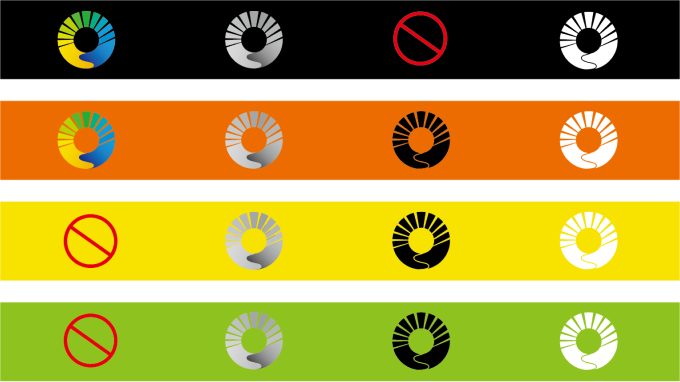
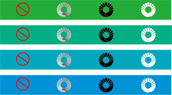
The symbol mark of the Sejong Special Self-Governing City's Facility Management Corporation has the best visual effect on a white background, so it should preferably be used in full color on a white background. If the use of background colors is restricted due to specific circumstances of the medium, it must comply with the color usage guidelines based on the background colors presented below. Incorrect use of colors can lead to loss of readability or confusion in the image due to brightness and saturation, so it should always be used effectively. The symbol mark must be clearly visible in relation to the background color, so if it is difficult to judge based on the criteria of this regulation, consultation with the responsible department is advised.
Color usage according to background color


The colors used in the symbol mark cannot be used as background colors.
Logotype
The logotype is one of the important elements of the Sejong Special Self-Governing City Facility Management Corporation, along with the symbol type. It has been developed as a unique typeface to harmonize well with the symbol mark while differentiating itself from other organizations. The logotype has been designed with consideration for harmony with other design elements and readability, and it should not be altered by adjusting the letter spacing or changing the thickness, as this could damage the image of the logotype. Therefore, when using or creating the logotype, it should be resized using the grid system and data included in the manual CD-ROM below.


Signature
The signature must use the data included in the manual CD-ROM without distortion in the form or color of the Identity Design to establish the visual identity of the Sejong Special Self-Governing City Facility Management Corporation.
Horizontal Combination


Signature Vertical Combination


